Climate Science 1
Or, why do we have a 'Goldilocks climate'?
Clearly, by far the most important source of virtually all our warmth and light is the Sun. But we are in the 'just right' position! Mars is too far away and much too cold, Venus is too close and too hot. (Venus also has a runaway greenhouse effect, but that's another story.) But there are a number of very important factors that determine just how much of the Sun's energy is retained by the Earth. It is this energy, of course, which drives our climate. Let's look at some of the more important ones.
How far?
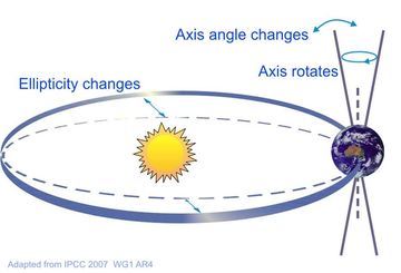
The Earth's distance from the Sun is crucial. Small changes can make quite a difference to the amount of energy received.
Interestingly, although very close to a circle, the Earth's orbit is not exactly circular, it is slightly elliptical. Furthermore, the amount of ellipticity varies over very long time periods. As well, the Earth's axis slowly rotates and even the 23½° angle gradually changes over very long times (tens to hundreds of thousands of years). These changes result in cycles of climate change referred to as Milankovitch cycles. It is these cycles that are responsible for the Earth moving in and out of ice ages over the last million or so years. More about this in Climate 2 'It's Milankovitch again!'
Interestingly, although very close to a circle, the Earth's orbit is not exactly circular, it is slightly elliptical. Furthermore, the amount of ellipticity varies over very long time periods. As well, the Earth's axis slowly rotates and even the 23½° angle gradually changes over very long times (tens to hundreds of thousands of years). These changes result in cycles of climate change referred to as Milankovitch cycles. It is these cycles that are responsible for the Earth moving in and out of ice ages over the last million or so years. More about this in Climate 2 'It's Milankovitch again!'
The Earth's energy balance
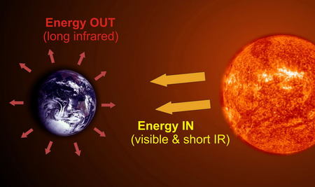
The light from the Sun includes visible light and invisible 'infrared' (IR - see note below). Most of this heats up the Earth. Of course if the Earth retained all this heat it would get hotter and hotter! But it doesn't, it radiates it away as what we call long wavelength infrared. (Just as any warm object radiates its heat away.) The hotter the Earth, the more IR is radiated. A balance is eventually struck between the incoming and outgoing radiation when the Earth is at the temperature at which the outgoing equals the incoming radiation. If, for some reason, the Earth retains, or loses, more heat than is being gained, it will heat up, or cool down, until the balance is restored.
A note on Infrared (IR) radiation: The Earth gains energy from the Sun in a very visible way - we can see and feel the energy from the Sun. But the visible radiation we see is only part of the story. Much of the radiation from the Sun comes as invisible 'heat radiation'. Scientists call this 'infrared' radiation. (The word 'radiation' is just a term for all the visible 'light' and invisible energy that comes from the Sun.)
Just think of an electric radiator when first turned on. Before it starts to glow we can feel the heat coming from it. That is infrared 'radiation'. As it gets hotter it starts to glow with visible (dull red) light as well. That is just the same as the infrared, but a shorter 'wavelength'. All this infrared and visible light is just 'electromagnetic waves'. Don't worry about the electromagnetic bit, but it is the wavelength that characterises the type of radiation. It turns out the wavelengths between 0.4 and 0.7 millionths of a metre are the 'rainbow spectrum' of visible light (violet to red). Longer than 0.7 is infrared and shorter than 0.4 is ultraviolet. All hot objects 'glow' with IR. The hotter the object the shorter the wavelength. In fact any object that is above the absolute zero of temperature 'glows', but at ordinary temperatures this is (relatively) very long wavelength (around 10 millionths of a metre) and harder to feel by just putting your hand near the object. In our context, however, that is very important, because it's this invisible long wavelength IR energy going out from the Earth that balances the incoming shorter wavelength (IR and visible) radiation that heats it. (For more on all this see the Climate Physics pages)
Something is keeping us warmer
In the 19th century physicists had unravelled the basic laws that govern heat and temperature (the so called 'laws of thermodynamics'). They knew, for example, a lot about why black things would both radiate and absorb more heat energy (infrared) than shiny ones. (That's why we have shiny teapots, but black solar hot water panels.) They discovered the laws that govern the amount of infrared radiation ('heat radiation') emitted by hot objects - in fact by any object warmer than the absolute zero temperature of —273°C. (Even ice is emitting infrared radiation - but in normal surroundings it will be absorbing more, and so melting!) Again, there's more about these laws in Climate Physics.
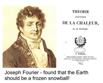
In the early 1800's, Joseph Fourier, using these laws and the known heat radiation coming from the Sun as well as the heat radiated from the Earth, calculated that the average temperature of the Earth should be approximately minus 15°C. Clearly an answer that was about 30 degrees too low!
He was confident the physics was correct (and we now know it was) and so he deduced that something in the atmosphere was trapping heat and keeping the Earth warmer than it would otherwise be. (Interestingly, we now know that the average temperature of the Moon is about —18°C, just about the temperature that Fourier would have expected!)
However, it was known that the two main components of the atmosphere, nitrogen and oxygen, were transparent to the invisible infrared radiation emitted from the warmed Earth, and so it was not the 99% of the atmosphere that was trapping the heat.
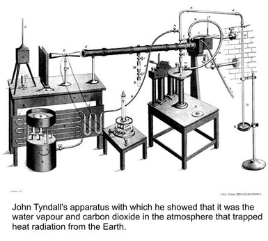
The problem was solved by another 19th century physicist, John Tyndall in around 1860. He performed a now famous experiment in which he shone infrared radiation down a tube to which he could add small amounts of gases such oxygen or carbon dioxide. He found that while oxygen and nitrogen had no effect on the infrared, even very small amounts of carbon dioxide absorbed it. He therefore deduced that it was the tiny amount of carbon dioxide (about 0.03%) and water vapour (amount varies, but less than 1%) in the atmosphere that were trapping the outgoing infrared radiation from the Earth, hence keeping it warmer than it would otherwise be.
The problem was solved by another 19th century physicist, John Tyndall in around 1860. He performed a now famous experiment in which he shone infrared radiation down a tube to which he could add small amounts of gases such oxygen or carbon dioxide. He found that while oxygen and nitrogen had no effect on the infrared, even very small amounts of carbon dioxide absorbed it. He therefore deduced that it was the tiny amount of carbon dioxide (about 0.03%) and water vapour (amount varies, but less than 1%) in the atmosphere that were trapping the outgoing infrared radiation from the Earth, hence keeping it warmer than it would otherwise be.
Svante Arrhenius and the 'Greenhouse effect'
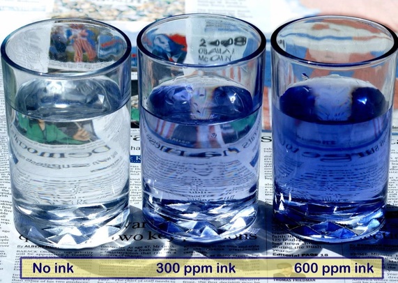
The glass on the left contains normal tap water. The one in the centre contains about 2 drops of ink, which is about 0.03% or 300 ppm. The one on the right has 4 drops, or 600 ppm of ink. Think of the water as representing the atmosphere. Visible light goes through it with almost no absorption. The ink in the centre glass is at the same concentration as the CO2 in the atmosphere around a hundred years ago. Clearly, although it is a tiny amount, the ink has a large effect on the amount of light that gets through the water - and doubling the amount of ink virtually doubles the light absorbed.
So instead of water, think atmosphere; instead of ink, think CO2; and instead of visible light, think infrared 'light'. (The terms 'light' and 'radiation' are equivalent for our purposes here.) In much the same way, the tiny amount of CO2 in the atmosphere has a large effect on the amount of the long wavelength infrared (heat) radiation we spoke of earlier. If we could see with infrared light instead of visible light the atmosphere would look quite dark!
So instead of water, think atmosphere; instead of ink, think CO2; and instead of visible light, think infrared 'light'. (The terms 'light' and 'radiation' are equivalent for our purposes here.) In much the same way, the tiny amount of CO2 in the atmosphere has a large effect on the amount of the long wavelength infrared (heat) radiation we spoke of earlier. If we could see with infrared light instead of visible light the atmosphere would look quite dark!
Because this is all a little like a greenhouse it has become known as the 'greenhouse effect'. (The physics is a bit different actually, but never mind, in both cases heat is trapped.) So the greenhouse effect keeps the Earth about +30°C degrees warmer (33 degrees actually) than it would be without that carbon dioxide and water vapour in the atmosphere. (We will return to the question of the relative roles of carbon dioxide and water vapour later.) So ...
The Greenhouse Effect: Thirty three degrees of warming
The greenhouse effect is thus crucial for life on Earth. Without it, Earth would be a lifeless frozen snowball. So clearly the important question is:
Given that we have increased the amount of CO2 in the atmosphere from less than 300 ppm to around 400 ppm and rising, how much more warming will we get?
Given that we have increased the amount of CO2 in the atmosphere from less than 300 ppm to around 400 ppm and rising, how much more warming will we get?
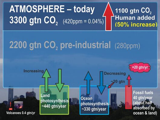
This diagram represents the amount of carbon dioxide in the atmosphere a couple of hundred years ago (pre-industrial) and today. The numbers shown are the total amounts of carbon dioxide in gigatonne (billion tonnes) in the atmosphere. Before industrialisation there were 2200 billion tonnes, but now there are 3100 billion tonnes. That is an increase of over 40%.
There is no doubt about the reason for the increase, it is our burning of fossil fuels. At present we are putting around 40 gtn of CO2 into the atmosphere every year. (In fact about 50 gtn CO2equiv if other greenhouse gases are included.) A little under half of this is absorbed by the oceans (making them more acidic) leaving something like 20 gtn to add to the CO2 in the atmosphere each year. So far this has added up to that extra 900 gtn.
(Another way of expressing these quantities is in parts per million as mentioned earlier. The 2200 gtn represents 280 ppm, the 3100 gtn, 400 ppm.)
Now it is important to note that carbon dioxide is pouring into and out of the atmosphere in huge quantities due to the natural processes of growth (photosynthesis) and decay. Every year about 800 gtn of CO2 go in and out of the biosphere as plants on land and in the ocean grow and die. This has been happening for thousands of years and has been pretty much in balance - as much goes in as goes out. Some people have noted, however, that our 40 gtn per year seems rather small compared to that 800 gtn and so claim that human emissions are only around 5% of 'total emissions'. This however totally misses the point that the 800 gtn is part of the natural (balanced) cycle whereas our 40 gtn is an EXTRA 5% EACH YEAR from a source which is not part of the natural cycle. This extra 5% per year has already added up to an extra 900 gtn of CO2 in the atmosphere, or an extra 43% over the pre-industrial atmosphere. It is this extra 43% total, which is increasing every year, that is the problem!
How the greenhouse effect works
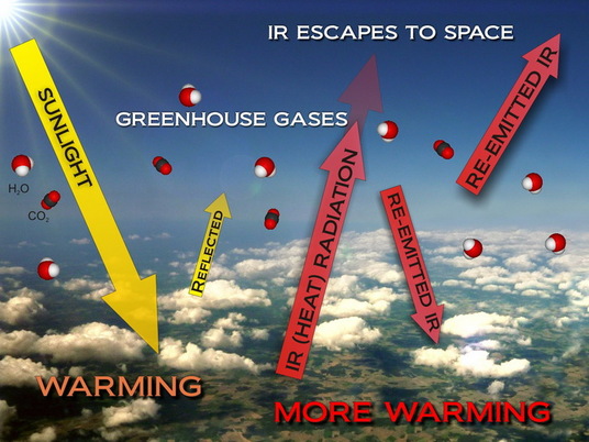
Clearly, with this increase in the main greenhouse gas we have to expect an increase in the greenhouse effect, and therefore in temperatures. The key problem for climate scientists is trying to predict just how much this rise is likely to be. So let's look at the greenhouse effect a little more closely.
The greenhouse effect is illustrated in this diagram. Sunlight carries energy from the Sun, most of which warms the Earth (a little is reflected by clouds). The warm earth radiates away its heat as infrared radiation. However, molecules of carbon dioxide (CO2) and water vapour (H2O) capture most of the infrared (IR) radiation. They rapidly re-radiate it, but of course about half of it goes downward back to the earth. Eventually as the earth warms up, a balance is struck between the IR being radiated from earth and IR escaping to space. But of course this happens when the earth has warmed sufficiently so that enough extra IR is emitted to balance that being returned.
At present this happens when the earth has warmed that extra +33 degrees we discussed earlier. However, if we add more CO2 (and/or H2O) clearly the earth must warm further to create that balance.
Now of course to work out just how many degrees more is complicated! A number of factors have to be taken into account. Some of them are:
- The amount of IR reflected, and absorbed, by clouds, and the amount of extra cloud - or loss of cloud as a result of the warming.
- The change in the amount of sunlight reaching the earth due to changing cloud formation.
- The relationship between the amount of CO2 and H2O in the atmosphere (discussed further below).
This is where the 'computer models' come in
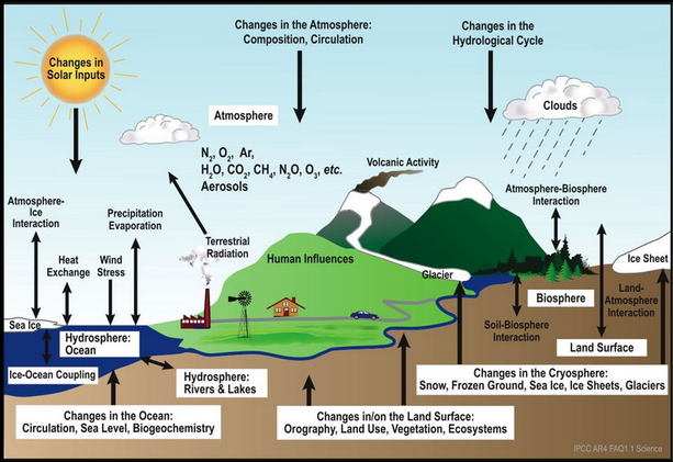
These are all physical processes and so can be calculated. However, the calculations are rather complex and require huge computing power. This is essentially what the 'computer models' that are often talked about do. We won't go into the workings of such models here, but suffice it to say it is 'simply' a matter of applying the well known laws of physics to a very complex system. Just some of the factors taken into account are shown in this diagram.
As an aside, it is worth noting here that there is an essential difference between these 'climate models' and the 'economic models' with which they are sometimes compared (usually in order to disparage them!). While the climate models work with basic and well known laws of physics, albeit on a complex system, economic models have to make guesses about human behaviour. Fortunately for climate science the laws of physics are much more predictable than any human behaviour! See the Climate Physics pages for more on how climate models work. Or for more, go to the Skeptical Science explanation or the government's 'Climate Change in Australia' site.
As an aside, it is worth noting here that there is an essential difference between these 'climate models' and the 'economic models' with which they are sometimes compared (usually in order to disparage them!). While the climate models work with basic and well known laws of physics, albeit on a complex system, economic models have to make guesses about human behaviour. Fortunately for climate science the laws of physics are much more predictable than any human behaviour! See the Climate Physics pages for more on how climate models work. Or for more, go to the Skeptical Science explanation or the government's 'Climate Change in Australia' site.
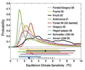
The computer models usually produce complicated looking graphs of what might happen to the climate in the future. One reasonably simple way of summing up the results is to talk about the 'equilibrium climate sensitivity'. This is usually quoted as the temperature rise we should expect if atmospheric CO2 levels doubled - that is, from 280 ppm to 560 ppm (likely later this century at present rates of emissions - even with the current national 'targets').
Now unfortunately not all computer models give us the same answer. This diagram from the IPCC AR4 WGI shows a typical set of results. It is a complex problem and the results depend on the sorts of assumptions made by the scientists doing the modelling. In fact the answers range from something over 1 degree up to 7 or 8 degrees, but the 'best guess' is around +3°C.
Now unfortunately not all computer models give us the same answer. This diagram from the IPCC AR4 WGI shows a typical set of results. It is a complex problem and the results depend on the sorts of assumptions made by the scientists doing the modelling. In fact the answers range from something over 1 degree up to 7 or 8 degrees, but the 'best guess' is around +3°C.
Update on sensitivity (April 2016)
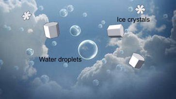
Clouds are an important negative feedback in the climate system. They tend to hold warming in check because as warming increases, so does the amount of moisture evaporated from oceans and lakes. This moisture forms more clouds, and clouds reflect sunlight back into space. However, they also hold warming in. As anyone who has camped in the desert knows, cloudless nights tend to be colder than cloudy ones. This is mostly because they absorb that infrared radiation the Earth is emitting, and re-emit some of it downwards again. Computer models attempt to take all this into account, but it is one of the biggest areas of uncertainty in climate science.
A further complication that has recently come to light is that the amount of sunlight reflected by clouds depends on their composition. Clouds are a mixture of ice crystals and supercooled water droplets (as indicated in the diagram). As you can imagine, the ice crystals tend to reflect more sunlight back into space than do the water droplets – which absorb more of the light, hence warming the cloud and therefore the atmosphere. However, and this is the crunch, with increased warming, the proportion of water droplets to ice crystals increases, hence decreasing the amount of sunlight reflected back to space. This effect has not previously been fully dealt with in climate models and so it may well be that the ‘sensitivity’ of the climate (the amount of warming as a result of doubling the CO2 levels) has been underestimated. The authors of this new study, published in Science recently [Ref.2] suggest that, as a result of this effect, the sensitivity may be over one degree higher than previous estimates, giving a ‘best guess’ sensitivity of around 5 degrees, considerably higher than past estimates. That is very concerning given that it is going to be very difficult to limit the CO2 in the atmosphere to 560 ppm (double the pre-industrial level) much less the 450 ppm previously thought necessary to limit warming to two degrees. (Many scientists say our goal should be more like 350 ppm!)
A further complication that has recently come to light is that the amount of sunlight reflected by clouds depends on their composition. Clouds are a mixture of ice crystals and supercooled water droplets (as indicated in the diagram). As you can imagine, the ice crystals tend to reflect more sunlight back into space than do the water droplets – which absorb more of the light, hence warming the cloud and therefore the atmosphere. However, and this is the crunch, with increased warming, the proportion of water droplets to ice crystals increases, hence decreasing the amount of sunlight reflected back to space. This effect has not previously been fully dealt with in climate models and so it may well be that the ‘sensitivity’ of the climate (the amount of warming as a result of doubling the CO2 levels) has been underestimated. The authors of this new study, published in Science recently [Ref.2] suggest that, as a result of this effect, the sensitivity may be over one degree higher than previous estimates, giving a ‘best guess’ sensitivity of around 5 degrees, considerably higher than past estimates. That is very concerning given that it is going to be very difficult to limit the CO2 in the atmosphere to 560 ppm (double the pre-industrial level) much less the 450 ppm previously thought necessary to limit warming to two degrees. (Many scientists say our goal should be more like 350 ppm!)
Let's look at the predictions
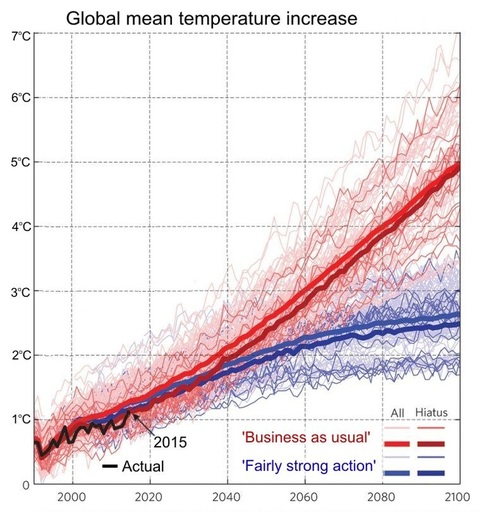
Perhaps a more useful way of expressing the results of the models is in terms of likely future temperature rises. Here is a graph adapted from a recent paper in Nature Climate Change [Ref.1] showing the results of many individual model runs as well as averages. There are a number of important points to note.
The red wiggly lines represent the predictions of individual climate models based on the 'business as usual' scenario, that is, not much reduction in emissions. The heavy red lines are the averages of those. These models suggest an average global temperature rise this century of between about 3 and 7 degrees with a most likely outcome of about 5 degrees.
The blue wiggly lines and average lines represent the predictions based on a 'fairly strong action' scenario. These suggest a temperature rise of around 2½ degrees, plus or minus about 1 degree by the end of the century.
[For the more technically minded, the 'Business as usual' corresponds to what the IPCC refer to as RCP8.5 and 'Fairly strong action' RCP4.5. RCP stands for the rather confusing term, 'Representative Concentration Pathways' as defined by the IPCC. For more detail on RCPs try this link.]
Now it is important to realise that while the average temperatures increase fairly smoothly, the individual models show a lot of variation from year to year. This is of course consistent with what we see in the actual temperatures and is one reason that it is not wise to look at short term changes as an indication of long term trends. The long term trends are only apparent over several decades as there are many factors that cause shorter term variations - the most well known one being the El Niño - La Niña cycle (or ENSO, for El Niño Southern Oscillation as it is more technically called). This is what was responsible for the very high temperatures in 1998 and last year's (2015) record temperatures. There are a number of other cycles, some well known and others less so that vary over periods of years or decades. The solar sunspot cycle is another. More about that in the section 'Is our climate changing?'
It is, of course, these short term changes that give rise to the very wiggly lines representing the outcomes of individual model runs. If we look at the individual predictions we find that some are quite consistent with the 'hiatus' we have seen over the last decade or so, and of course some are not. So what the authors of this study did was to take only the individual model runs which were consistent with the hiatus and average just those. That is what the heavier red and blue lines represent. As is clear on the graph, it didn't make much difference to the 'end of century' outcome. The reason for that is clear enough. We expect large variations over periods of a decade or two, but the overall trend is not affected by these variations - they average out in the long run. This is why it makes little sense to look at the figures for the last 17 years (from the high of 1998) and claim that somehow the warming has stopped.
But can we trust computer models?
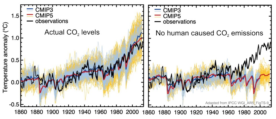
There are two ways to check the predictions of computer models - wait and see, or run them backwards! We can't afford to wait and see whether the climate changes in dangerous ways - but we can run them backwards. Well not exactly 'backwards', but we can see whether they correctly 'predict' past changes. This is just what scientists do to check their models. They put in the conditions back when reliable temperature and other climate records were first made (about 150 years ago) then added the various known influences on the climate (volcanoes, the Sun cycles, changing CO2 and so on) and run the computers. The two diagrams below show typical results. The various thin blue and yellow lines represent individual results. The thicker blue and red lines the average of those results from two sets of models, known as CMIP3 and CMIP5. The graph on the left shows what happens when the actual known levels of CO2 are put in, but the graph on the right shows the results if we remove the human added CO2 levels. Clearly, the computer predictions are quite accurate with real CO2 levels, but the results when human caused emissions are omitted are quite wrong. This gives us confidence in the models - and also confirms that it is clearly our burning of fossil fuels that have caused the increasing temperatures. You may notice a slight drop in the actual temperatures, relative to average predictions, in the last decade or so. This is the so-called 'hiatus' referred to above and which has received a lot of attention from some folk. But you will also notice (again) that it is quite within the blue lines - the predictions of individual model runs. It is important to note that the smoothed lines are the averages of all the predictions. It is not correct to say that the models predict a steady increase in temperature, the models themselves predict a lot of variation over short terms - but a longer term rise. More about this in the 'Is our climate changing?' section.
It's not just computer models
As well as the predictions of computers, scientists have other ways of estimating what might happen with increasing CO2 emissions. We know a lot about what has happened to the Earth's climate in the past. We also know what has caused past changes - meteor impacts, changes in the Sun's output, changes in the Earth's orbit, huge volcanic events and so on. There have been many changes in the atmosphere - as the result of changing life forms, tectonic plate movement, volcanic activity and so on - and these can give us a clue to the factors that effect the climate. In particular, past changing CO2 levels can tell us a lot about what we should expect with the changes we are causing now. We will examine the way studies of the past climate can help us understand present changes more in the next section about the Earth's changing climate.
A word about greenhouse gases
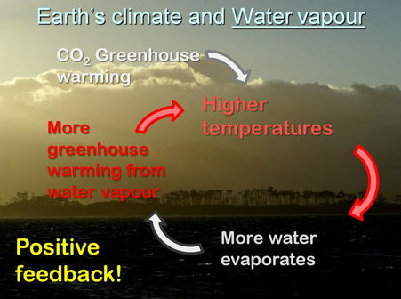
We have concentrated on carbon dioxide in our discussions for two reasons. 1) It is the most important greenhouse gas and 2) it is the one we have dramatically altered. As we have said, water vapour is also a significant greenhouse gas, in fact in terms of the immediate absorption of infrared it wins - something like 50% for H2O and 25% for CO2. BUT, and this is a very important 'but' - once CO2 goes into the atmosphere it stays there for centuries while H2O goes in and out with the weather on a daily basis. For this reason CO2 is referred to as a 'forcing greenhouse gas' while H2O is a 'feedback greenhouse gas'. In other words, the CO2 levels affect the H2O levels. As the climate warms due to increasing CO2, more evaporation from oceans and lakes will occur, thus reinforcing the warming. This is what is referred to as a 'feedback' effect, hence the labelling of water vapour as 'feedback greenhouse gas'.
This is an example of 'positive feedback' - the more one thing changes the more the other does as well. Fortunately there are 'negative feedbacks' involved as well! One example is that the more water vapour that goes into the atmosphere, the more clouds form - and reflect sunlight away - thus limiting the warming. This is one reason the Earth has not had a runaway greenhouse effect like Venus has! However, clouds also hold heat in and trap infrared - and that's a positive feedback. Sorting it all out is complicated - but that's what scientists like to do!
This is an example of 'positive feedback' - the more one thing changes the more the other does as well. Fortunately there are 'negative feedbacks' involved as well! One example is that the more water vapour that goes into the atmosphere, the more clouds form - and reflect sunlight away - thus limiting the warming. This is one reason the Earth has not had a runaway greenhouse effect like Venus has! However, clouds also hold heat in and trap infrared - and that's a positive feedback. Sorting it all out is complicated - but that's what scientists like to do!
Another greenhouse gas we haven't had space to mention is methane. There are several sources of methane - animals, melting permafrost, fermenting land fill and the mining and processing of natural gas. All of these are important - and growing! Although molecule for molecule methane is a more potent greenhouse gas, there is over 200 times as much carbon dioxide in the atmosphere and so the total effect of methane is only about a fifth as much. However, much of the methane is the result of human activity and so it is very important to try to reduce the activities that produce it - eating red meat for example. Agriculture generally is responsible for something like 20% of Australian greenhouse emissions.
More feedbacks
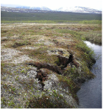
More particularly, a lot of methane is being produced in the Arctic where permafrost is melting at an increasing rate. Unfortunately this is another example of a positive feedback effect - more warming - more methane - more warming. Also unfortunately, there is no negative feedback associated with melting permafrost as there are huge amounts of it in the frozen Arctic soils and the warmer things get the faster it is released. There is some hope that certain organisms will slow the release of methane from melting soils, but the extent to which this will have any significant effect is very debatable at present. We can only hope, because a runaway release of methane in the Arctic would increase the overall greenhouse effect enormously.

Unfortunately the Arctic is warming faster than most places on Earth for various reasons, one being another 'positive feedback' effect. When sea ice melts, the very reflective white surface of the ice is replaced by dark, sunlight absorbing water. The dark water absorbs more energy and melts more ice - ever expanding the area of dark, heat absorbing water - and adding yet more heat to the Arctic climate.
But is it us?
There is no doubt that the level of CO2 in the atmosphere has increased by over 40% in the last century or so. There is also no doubt that temperatures have increased. But there are three questions people ask about all this:
1) Is the temperature rise due to the added CO2?
2) Is it actually our use of fossil fuels that has caused the added CO2
3) Will it actually matter if the average temperature of the Earth rises a few degrees?
Hopefully, from what you have read above, you will have little doubt that the temperature rise is related to the CO2 increase. The physics of this is all but settled. There is no other explanation for that extra +33 degrees that the Earth has over what would be expected without a greenhouse effect and it is extremely unlikely that if we add to the CO2 in the atmosphere the thirty three degrees won't increase also.
To imagine that somehow the the extra roughly 20 billion tonnes of CO2 that are appearing in the atmosphere every year is not the result of the well over 35 billion tonnes or so that we are putting into the atmosphere every year by burning fossil fuels really does beggar belief. The science is very clear. (And of course most of the other half of the 30 billion tonnes is going into the ocean - making it more acidic and thus threatening ocean life and coral reefs.)
But more on this question of whether it is 'really us' in the next section on the Earth's changing climate, and we return to the question about whether it matters in the third section, does it really matter.
[PS: Apologies for the lack of subscripts in CO2 and H2O! Unfortunately Weebly doesn't allow them]

